← All work
BrandingWeb DesignMotionArt Direction
Éternel
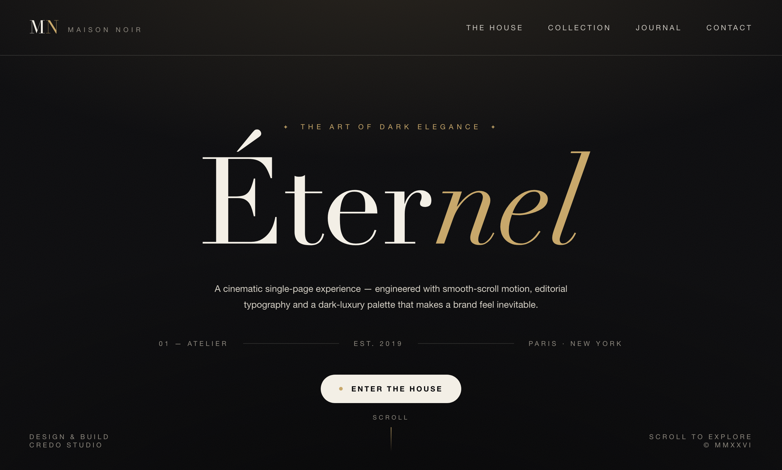
A concept identity and single-page site for a modern fashion house — dark-luxury art direction, editorial typography and cinematic smooth-scroll motion.
A concept identity and single-page site for a modern fashion house — dark-luxury art direction, editorial typography and cinematic smooth-scroll motion.
Most fashion sites shout. We wanted the opposite: a homepage that feels like walking into a quiet, expensive room. The goal for Éternel was to prove that a single, well-directed page can carry an entire brand — no mega-menu, no clutter, just atmosphere and one clear invitation.
The challenge was restraint. Dark-luxury goes wrong the moment it feels like a template. Every choice — the exact off-black, the serif's italic, the pace of the scroll — had to earn its place.
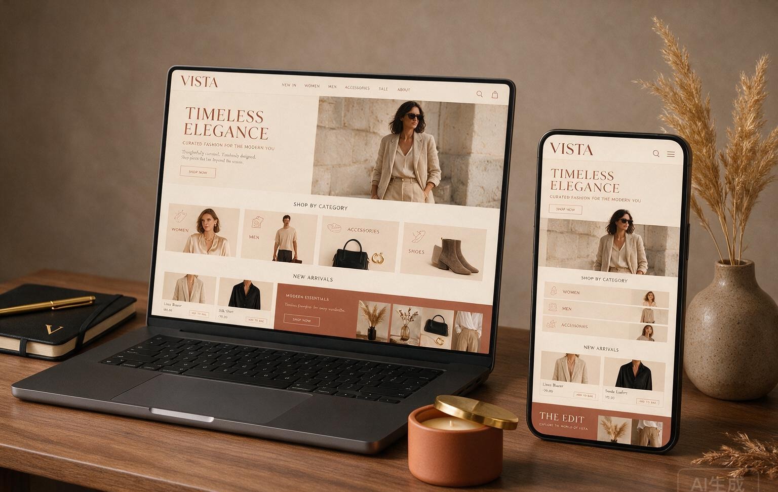
We built the whole page around a single serif headline and a palette of near-black, bone and a warm metallic. Everything else is negative space and timing.
“Luxury online isn't about adding gold — it's about how much you're confident enough to leave out.”
Éternel is the reference we point clients to when they want "premium" without a definition. It demonstrates the level of art direction, typography and front-end craft we bring to identity-led sites.