← All work
Product MarketingWeb DesignUI System
Northwind
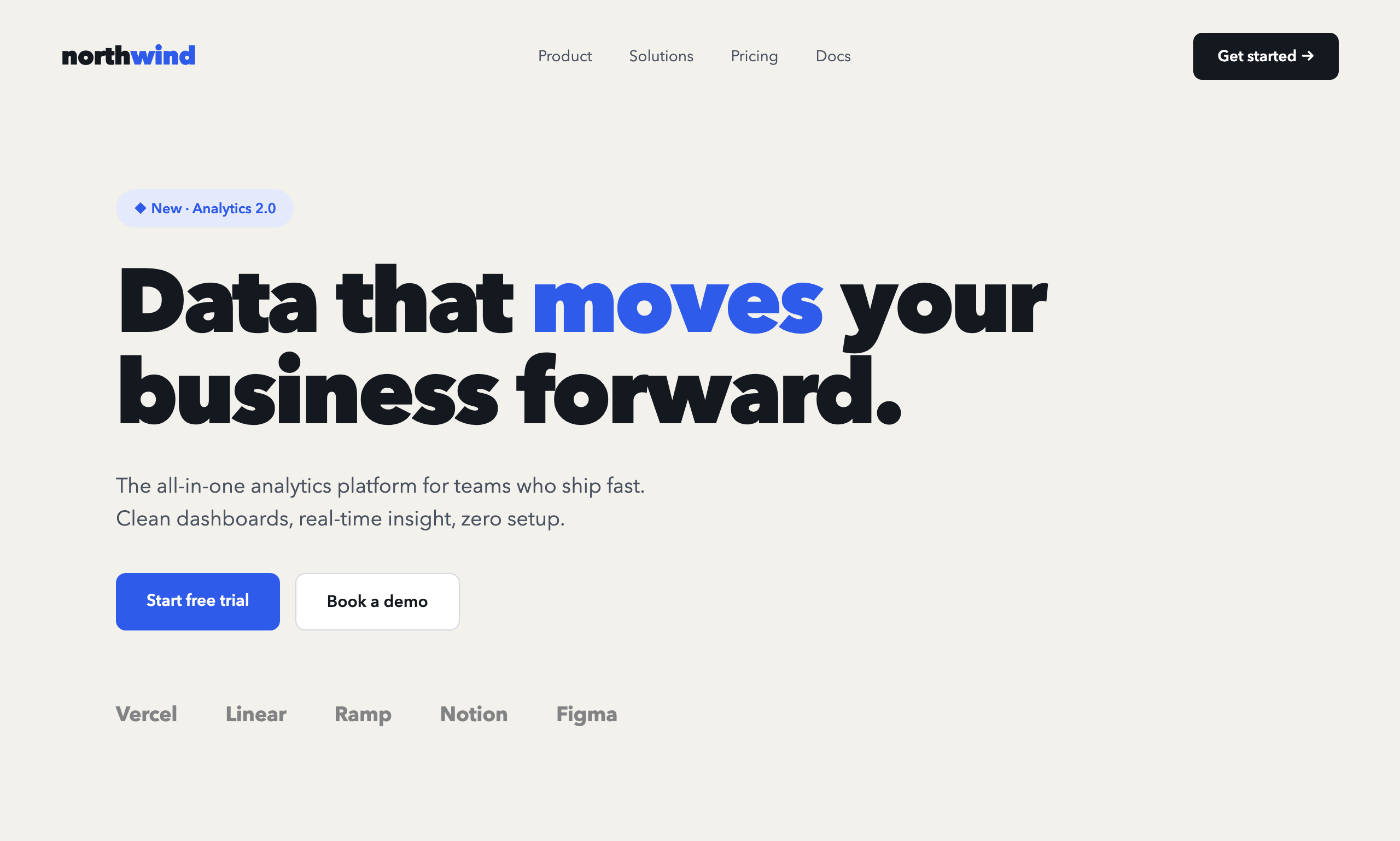
A concept marketing site for an analytics SaaS — clear product storytelling, a confident type system and a conversion-first layout that earns the free-trial click.
A concept marketing site for an analytics SaaS — clear product storytelling, a confident type system and a conversion-first layout that earns the free-trial click.
SaaS homepages tend to drown in features. Northwind was a deliberate exercise in the opposite discipline: say what the product does in one line, show it, and make the next step obvious — all above the fold.
Where Éternel is about atmosphere, Northwind is about clarity and trust. Different brief, different world: a cool, precise, product-led system instead of dark-luxury mood.
We led with a single value-proposition headline and an accent-blue system that carries the eye from promise → proof → action.
“If a visitor can't say what you do and what to click within five seconds, the design has failed — no matter how it looks.”
Northwind is our reference for product and startup clients — proof that we can turn a feature list into a clear, credible story that moves a visitor toward signup.