← All work
EditorialWeb DesignArt Direction

Verso

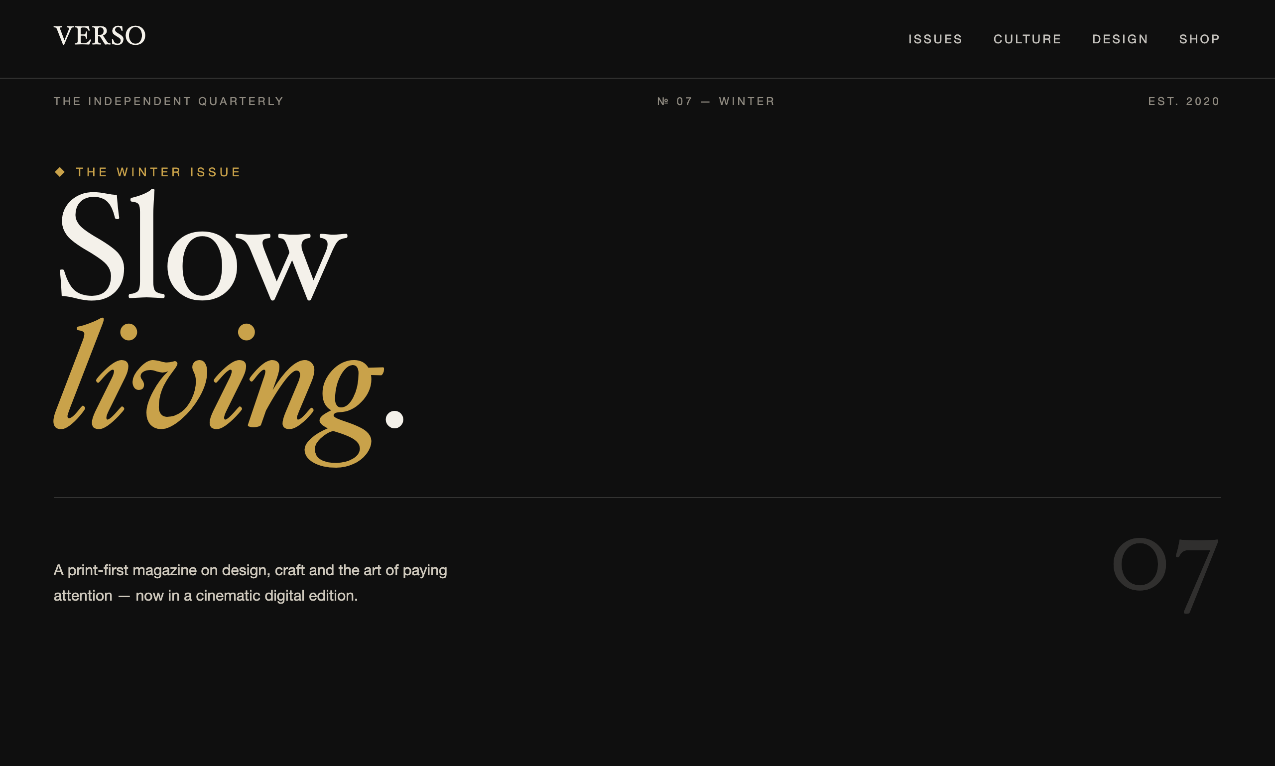
A concept digital edition for an independent print magazine — editorial art direction, a serif-led type system and a reading experience that feels as considered as the paper it came from.

Type
Concept project
(self-initiated)
Services
Art direction, web design & build
Year
2026
Focus
Typography & rhythm
Verso homepage

the brief.

Print people are the hardest audience to impress on screen — they notice everything. Verso asked a simple question: can a website carry the weight and calm of a well-set magazine, instead of feeling like a feed?

A third distinct world from Éternel and Northwind: warm paper tones, oversized numerals and a rhythm built for reading, not scanning.

Verso layout

our approach.

We treated the screen like a spread: a strong grid, generous margins, and typography doing almost all of the work.

  • A serif spine. A single high-contrast serif for display, a quiet grotesque for captions and meta — the classic editorial pairing.
  • Issue numerals. Oversized № markers give each section a sense of place, like folios in a magazine.
  • Reading rhythm. Measured line lengths and vertical spacing tuned for long-form, with slow reveals that pace the scroll.
  • Restraint in colour. Ink, paper and one accent — the design stays out of the writing's way.
“Good editorial design is invisible — you feel the calm before you notice a single decision that made it.”
Credo — design principle behind Verso

what it shows.

Verso is our reference for publishers, writers and content-led brands — proof that we can build a site where typography and pacing, not decoration, do the persuading.

2Typefaces, one voice
100%Hand-set grid
AAContrast target
Back to the start
Éternel →
01 / 03